As I mentioned in the last post, a large quantity of data is available in this set of logs, which include several hundred edits that Rogers web-caching servers had forwarded for its customers in Ontario.
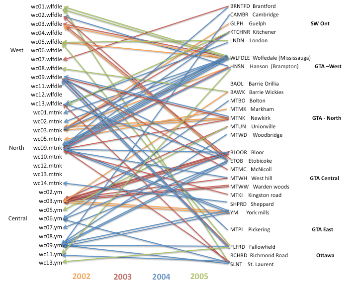
Because this log includes the IPs of both the proxy and the individual user, and because the individual IPs can be identified geographically, it is possible for us to see whether there is a tendency for certain centers to send their traffic through certain proxies. This is what the map posted above explores.
On the left are the proxies that appear in these logs; at the right the localities of the individual IPs. The colors of the lines are based on the years. (I hoped that by including the years, some pattern might become apparent.) Multiple visits in a year by the same individual IP get only a single arrow.
In the end, no pattern is obvious: it seems that any region can send traffic to any proxy.
No comments:
Post a Comment